By reducing the number of options that a user has to consider, you can often increase conversions. Why is this? That’s going to be the topic of this post, and we’re going to explore it in terms of psychology, and then how that turns into conversion lifts. Let’s go.
First, we need to understand 2 things. Our website visitors have motivation, and they have willpower. Motivation is what compels visitors to set out and look for a solution to their problem or a means to satisfy their desire. It’s the spark that leaves them with the intention of doing something, but it does not carry them through from intention to taking action. Super simple: motivation leads to setting a goal. Got it? Cool.
So what does move the visitor from forming an intention/goal to carrying through with an action? The answer is willpower. Willpower is the factor in the mind of your visitor that takes your visitor from “intending” to do something – to actually doing it. Super simple: Willpower is the pursuit of a goal the visitor has set for them self.
So to be clear: motivation is outside of our control; we cannot, in any way, influence the “goals” a visitor sets for herself, but we can impact the amount of willpower required for the visitor to achieve her goal on our website. That means we can affect how hard, or easy, it is for a visitor to get the information or make the purchase they came to our website for.
Here’s what you didn’t know was reducing conversions…
It’s not too widely known that as human beings our willpower is something that gets depleted the more you use it. That’s right, sitting at the restaurant and ignoring the bread & butter placed in front of you the whole time will leave you with less willpower to resist having snacks late at night. It’s a topic that’s discussed in this article about ego depletion (depletion of willpower), and this book about willpower.
Cool! So now we know that willpower is a depletable resource, and it’s different from motivation, which is the spark that sets a goal for our visitors.
But – and this is critical:
Each decision we ask our visitors to make reduces their willpower, and thus reduces the chance they’ll decide to buy. (Tweet this!)
Got that?
Ok, sure, but why? This is the science behind why: decision fatigue. Simply put, decision fatigue works like this: every decision you ask someone to make reduces their willpower. This was demonstrated in a study by researchers at Florida State University when they went to the place that forces people to make the most decisions in the shortest amount of time – yep, the suburban mall. These researchers interviewed shoppers about their experiences in the stores while shopping and then asked them to solve some simple arithmetic problems. Researchers asked participants to solve as many simple problems as they could, but said they could quit at any time.
Now here’s the key insight: the shoppers that made the most decisions on that day were the quickest to give up on doing math problems. They had less self-control and did not have the willpower to continue solving simple math problems as long as those shoppers that made less decisions. In this case, shoppers that made more decisions could tolerate doing simple math problems for a significantly shorter periods of time, when compared to shoppers that made less decisions.
The process of: 1) evaluating multiple options, 2) selecting the best, and 3) taking the action to buy the option selected significantly reduces the willpower a visitor has to complete the task (or goal) they’ve set for themselves.
So the more decisions we force people to make, the more likely they are to default to the easiest decision they can make. Since making a buying decision requires a lot of research, synthesis, and trust, it’s a lot easier to decide not to buy, than it is to consider several companies, consider all the options each company provides, and then make a decision about which company’s product is the best.
How do we apply this theory to practice and increase conversions?
Simple answer: reduce options available, or create categories on your site that break large groups of products into smaller groups. Joanna Wiebe from CopyHackers gives a pretty good explanation of how visitors categorize options in their mind in her newsletter. If we ask our visitors to make a lot of decisions on our website, then we’re draining them of the willpower they have to accomplish the goal they’ve set for themselves and the goal we’re trying to get them to achieve on our website.
You’d be surprised by how many decisions we force a visitor to make.
Let’s take a look at a real world example of a website selling creative resume designs.
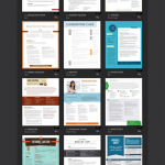
Here’s a screenshot of Loft Resumes homepage:
Every resume on this catalogue-type page is forcing the visitor to make a decision. Visitors go through and sort the resumes on the page into 2 groups: the “no” group, and the “maybe” group. Mentally, once they have reduced the resumes (in the “maybe” group) to a smaller number of options, that’s when they start saying yes or no to each, and ultimately get down to the one they’ll buy.
The visitor has to make a lot of decisions on the page above, just to settle on the few resumes they’d actually consider buying. Since we know that each decision we ask a visitor to make depletes the willpower they have to accomplish their goal of finding and buying a resume, we can reasonably assume that reducing the number of options available to the visitor will result in more people moving further down the funnel.
But how do we decide which options to eliminate?
Well, let’s dive into our Crazyegg data and see what we can sniff out.
Here’s a screenshot of all the clicks this page has received:
Notice how there are really few clicks on most of the resumes in the last 5-6 horizontal rows.
Let’s also take a look at the overlay-view in Crazyegg, specifically at how many clicks the resumes in the lower rows received, and see if we can deduce anything from that.
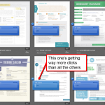
Here’s a screenshot:
See how the center resume on the bottom row got 125 clicks while others are getting less than 71? This is a pretty good indicator that we can move the less popular resumes to a category page, in order to reduce the number of decisions a visitor has to make. Then we can move the most popular resumes to a higher position on the homepage, putting the resumes that are most likely to sell in front of the visitor as they arrive to the site. That will reduce options, and increase the probability that the visitor will buy. Sweet!
Scientific proof that reducing decisions works
Well, let’s look to science for proof this works. Sheena Iyengar, a professor at Columbia University, conducted an experiment at a high-end grocery store on 2 different Saturdays; this was written about in the NY Times. On one of those days, she offered the patrons of the store 24 different flavors of jam, and on the other, she offered only 6.
Now pay close attention to what happened when the number of choices was reduced.
The day she offered 24 jams, 60% of customers stopped to taste the jams, and 3% of the people that stopped bought some jam.
On the day she offered 6 jams, 40% of customers stopped, and 30% of the people that stopped bought some jam.
The larger display brought in more people, while the smaller display brought in less people, but sold 600% more jam.
But how many choices should we provide visitors?
Alright, well, now we have evidence that reducing options can result in more sales, but what about online situations specifically?
The answer to this question is to test. Every situation is going to be different. You should not be benchmarking your business against your industry, or your competitors – you should be competing with yourself when aiming to increase conversions. Your specific business—with its audience, at this current point in time—is going to respond differently than other businesses to any change you propose.
So, to find the optimal number of choices to present, start by testing. Then interpret the results of your tests to determine further tests to get conversion lifts.


I just finished reading the book “The Paradox of Choice” and found it extremely helpful for making decisions in marketing, business, and even personal life in general.
Hi Peter,
Sounds like a cool book. What did you discover that you found helpful?
Great article. We’ve found this to be very true. After a recent redesign, where we simplified our site design dramatically, our conversion rate nearly doubled (as measured by convertible visitors/lead). It’s still early, but indications are good so far that the simplification works very well for helping our prospects make a decision.
Commercials always have too be loud.