Getting your next conversion rate lift doesn’t have to be this hard…You might think there’s a big secret to getting this kind of result. Truth be told, there is. It’s a secret only because most marketers don’t obsessively study CRO, or manically measure everything they can about their site. Most CRO’s don’t publish the stuff clients pay them many thousands of dollars for on the internet. But, I’m about to do exactly that…
I’m going to spare you the analytics-aches and the effort it takes for many marketers to figure this stuff out. I’m just going to openly tell you about my process.
You’re gonna get 3 things here:
– How to steal conversion-boosting insights with surveys
– How to write a new sales message with those insights
– How to analyze the impact your test had
Okay. So, to get this, you’re going to need a quick primer: CROs work by getting insights that reveal your customers’ underlying motivations. Then we show your site’s visitors that your site can give them what they want.
The key here is that we’re getting QUALITATIVE INSIGHTS that let us peer into the mind of your customers and know what they’re thinking as they shop on your site.
So the question is, how do we get those insights? One-word answer: surveys.
But not just any surveys.
And not just any survey questions.
The questions you ask in surveys have to be engineered to yield responses with the exact words your visitors need to read to experience the feelings of desire and trust required for them to buy from you.
It takes a bit of training to teach you to write good survey questions from scratch. But… there is a survey that’s already written, that contains questions engineered to yield responses with QUALITATIVE INSIGHTS, and exact words to put on your website.
Product/Market Fit Survey
The survey I use is called a Product/Market Fit Survey …I used it to get a 64.8% conversion lift in completed purchases for LoftResumes.com. The Product/Market Fit Survey was created by Sean Ellis to evaluate whether or not he would start working with a startup as an interim growth-focused marketer.
Before we go into the survey, here’s a quick note about Loft Resumes: It is a resume-designing service. They take the written content of a resume and turn it into a beautiful, visually designed document. Their value proposition for customers is that they will help a resume stand out in a pile of typical resumes. They get their customers noticed. Get them more interviews… and hopefully a job. Now that you know about Loft Resumes, here’s how we did the survey…
Loft Resumes had only about 100 customers we were able to survey at the time. So, we needed to be very careful to get the maximum response rate for the survey we’d be sending out. We managed to get 86 survey responses after sending the survey to their 100 customers.
Here’s how…
We implemented a trick (I learned from Joanna Weibe). We sent a sequence of 4 emails.
– 1 to let them know we were going to send them a survey
– 1 that included the survey
– 1 reminding them to fill out the survey
– 1 thanking everyone who took the survey, with a link to the survey for people who hadn’t yet taken the survey
People who’d already taken the survey we’re excluded from the remainder of the emails. Those 4 emails enabled us to get an 86% survey response rate.
Next I started tagging responses provided by customers. All right, wait up! Hold up!
I can hear you now…
“What do you mean by ‘tagging’?” OK, I hear ya.
I read through all the customers’ survey responses and I started labeling the responses that seemed similar, related to a specific benefit, or related to an objection. This way I could group them together.
The easiest way to explain this is probably just to show you. So next up, you get screenshots from Survey Monkey demonstrating this whole process.
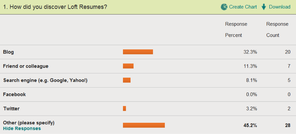
How Are Your Customers Finding You?
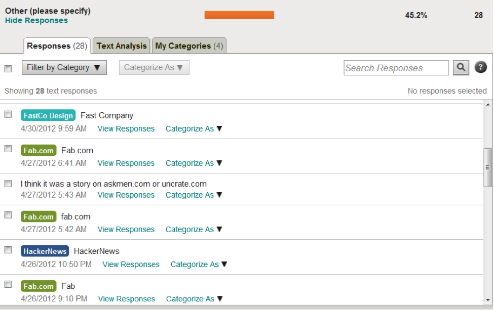
The best insights are from the “other” section. As you’ll see below, I’ve tagged/labeled them to organize them better, and later, quantify them.
The question above gives me insights into how customers found Loft Resumes, and websites where they may want to consider display-advertising, or media-buys.
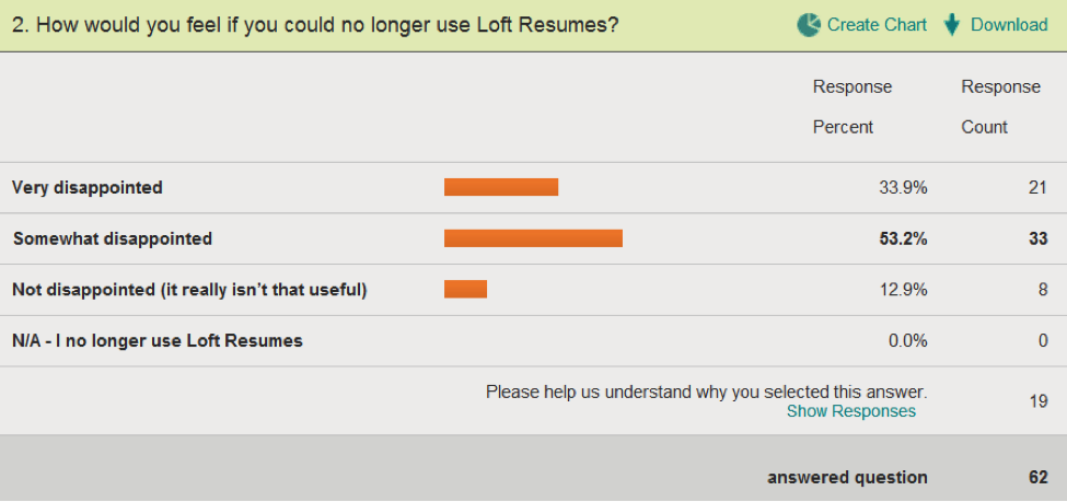
The next question defines this survey. Question 2 is the Product/Market Fit question.
The Product Market Fit Question:
By asking customers how disappointed they’d be, they segment themselves into different groups. The customers who’ve had a “must have” experience selected “very disappointed.” These customers are the most enthusiastic about the product, are most likely to generate more revenue, and have a higher life-time value.
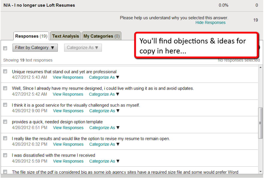
You can use Survey Monkey to segment responses and view customers who selected “Very Disappointed.” Their responses will have great insights, so pay close attention to them.
Also, make sure you review the “help us understand why” responses.
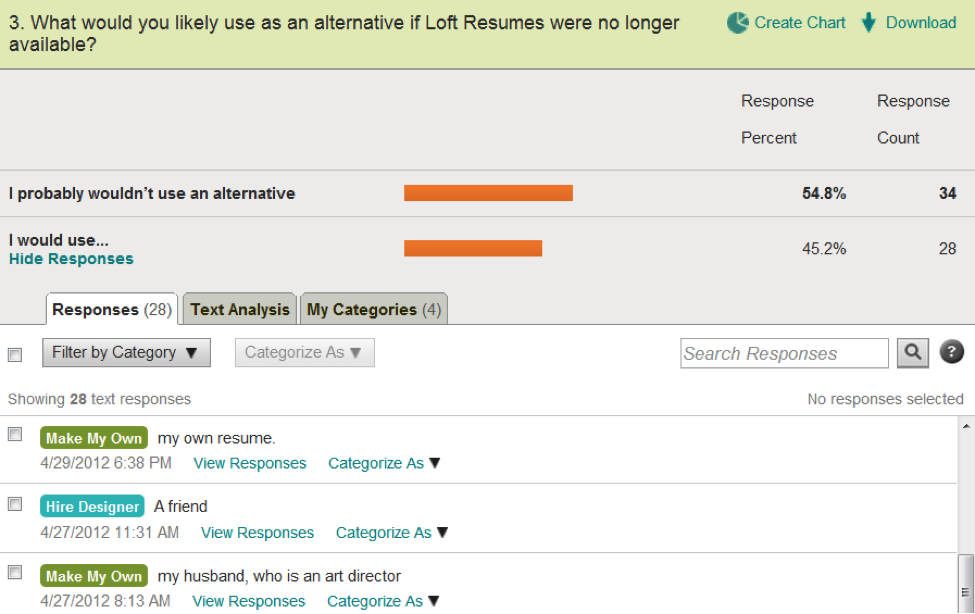
The next question will tell you who your true competitors are. You competitors are not the sites ranking above and below you for the keywords you’re targeting with SEO or Adwords. Your competitors are the companies or solutions your customers would use if they had to replace you tomorrow.
Who Are Your True Competitors?
For Loft Resumes, their main competitors were people who would design a resume themselves, or people who’d hire a designer to design one for them.
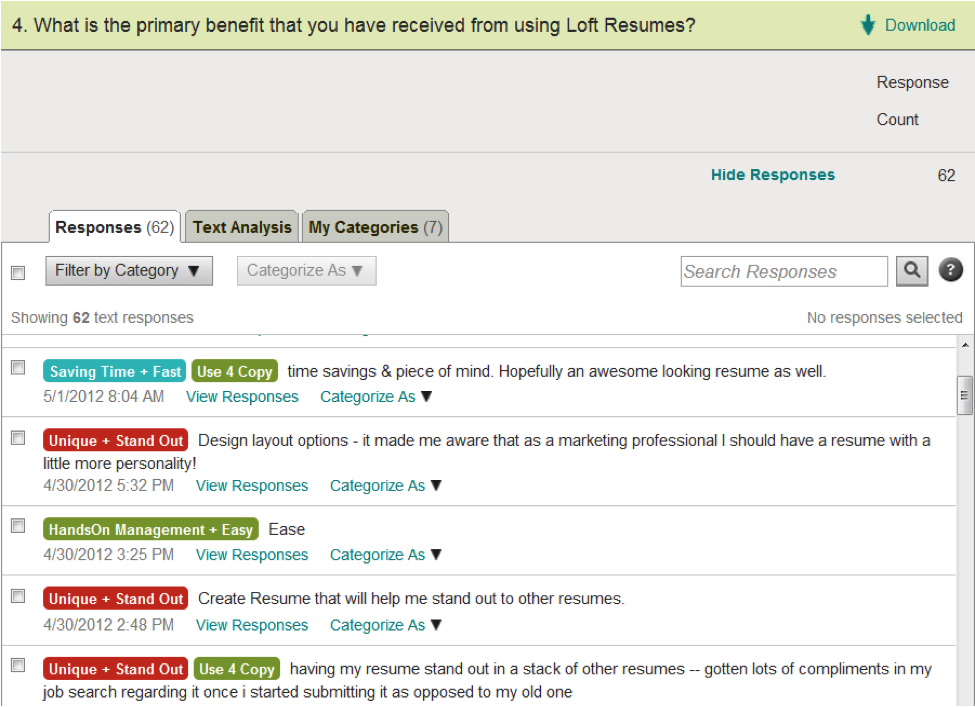
The next survey question will show you the main benefits customers received, and the words they used to talk about your offering. These responses can be used to produce high-converting copy. When you write the new copy for the page/site you’re optimizing, you’ll write to the points you discover in the question below. This question is engineered to get you qualitative insights.
What Exact Words Will Make More Customers Convert?
The benefits you see repeated the most in the survey data will translate into the copy you write on the site. You’ll give the copy that speaks to those benefits the highest priority on the site/page, and that will attract more customers similar to the ones who gave you the survey responses.
That’s important. It’s critical that you really grasp that. You’ll attract customers who are similar to these survey respondents in terms of buying habits & average order size, because you’re using the benefits that persuaded them to make a purchase. So you want to make sure and use the benefits that persuaded your high-value customers, so you can attract more high-value customers through your site. If you have the luxury of being able to, you should segment your customer database and survey the people who’ve spent the most money with you… so you can attract more of them.
You can use the question above, and the question below to write a section like this for your site:
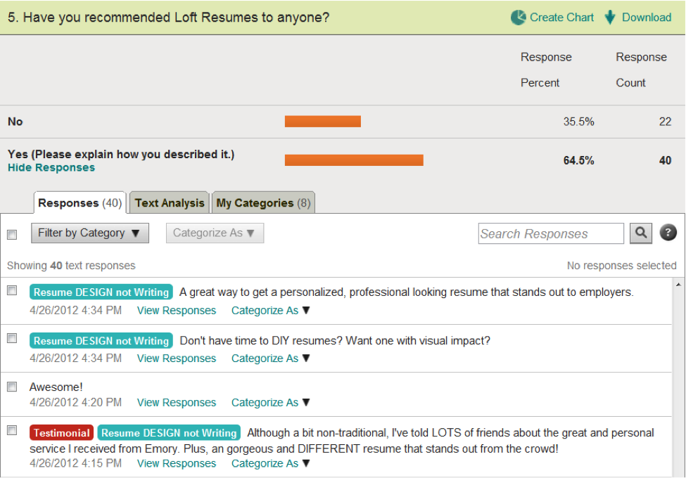
The following question does two things at once. First, it’s engineered to reveal the language your customers use when they think about buying your product. It’s the language they use in their head when they think and your products, and use with their friends when they’re recommending your products. These are the exact words they use, which you can (sometimes) copy and paste onto your site to increase conversions.
Second, this question tells you what your recommendation rate is. Later, you can work to improve the rate at which customers recommend your company/products to other people with referral systems, viral loops, and more.
What’s Your Recommendation Rate? And, More Language to Steal From Your Customers:
Loft Resumes had a 64.5% recommendation rate; meaning, 64.5% of their customers say they’ve recommended Loft Resumes to a friend. This rate is pretty good, but for a new company, I’d like to see it up over 70%.
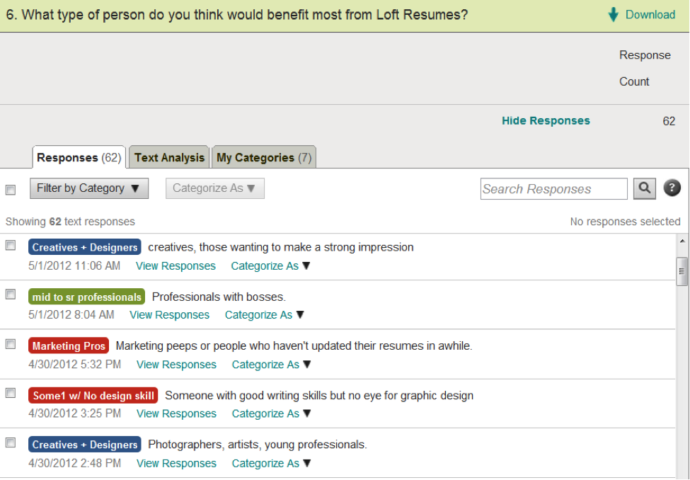
The following question will identify personas you can write copy for or develop marketing campaigns for. This enables you to craft your “Ideal for” statements.
What Personas Should You Write For When Optimizing?
Based on the data from the question above, we used this “Ideal For” statement on Loft Resumes homepage: “Ideal For Marketing Professionals, Designers, And People In Creative Industries.”
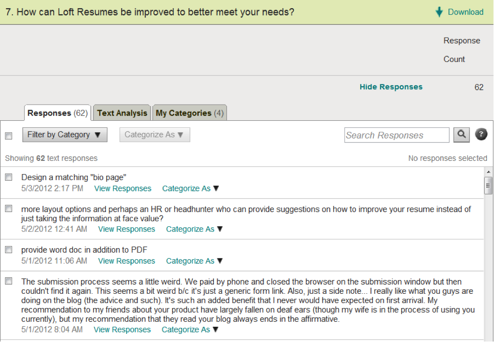
Finally, you can find ideas (from your customers) for how to improve your product and how to improve the experience on your site:
Stealing Profitable Ideas From Your Customers #LikeaBoss:
After I’ve gone through and identified the primary benefits, objections, and other related responses that emerged, I started organizing customer responses based on how they could help me with copywriting.
I divided the responses into 4 sections:
Attention
Interest
Desire
Action (Usually nothing goes here)
If you’re curious about what this looks like when it’s done, have a gander here.
At this point, I’ve gotten some pretty good ammunition for writing a new sales message on the page. This is where I look at the competitive analysis I’ve done, think about market sophistication, and how I can make Loft Resumes stand out among competitors. I think about how I can make their messaging stick in someone’s mind, if that person has 10 tabs open in their browser.
I also consider third-party sources/information I can leverage to make my arguments more believable.
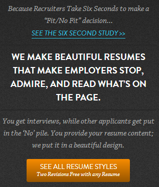
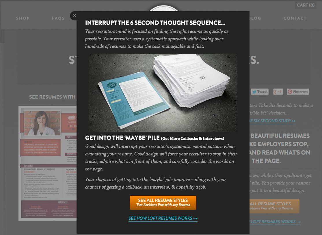
In Loft Resumes’ case, The Ladders had recently published a study about how professional recruiters evaluate resumes while searching for suitable candidates for a job. See the study here. As it turns out, recruiters only spend 6 seconds looking at a resume before they make a “fit/no fit” decision about the candidate and the position they’re recruiting for. Interesting fact, right? It’s also something I can leverage for the new page treatment.
We decided to stick this information in a lightbox, and use it to our advantage like this:
Now that we’ve surveyed our customers to learn how they perceive the benefits offered by Loft Resumes. And, we’ve considered the messaging they’re competing with out in the marketplace, AND we’ve considered third-party credibility sources – we have all the ingredients for the new sales message recipe ready.
First Iteration of the New Sales Message:
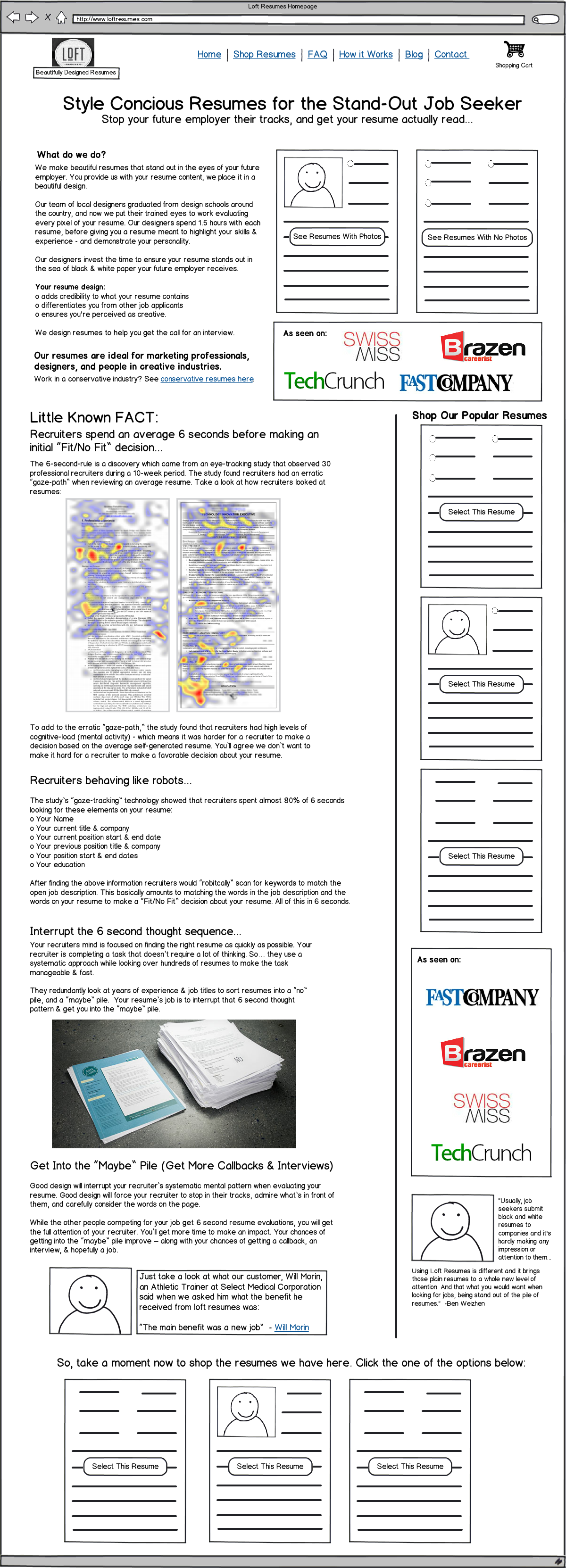
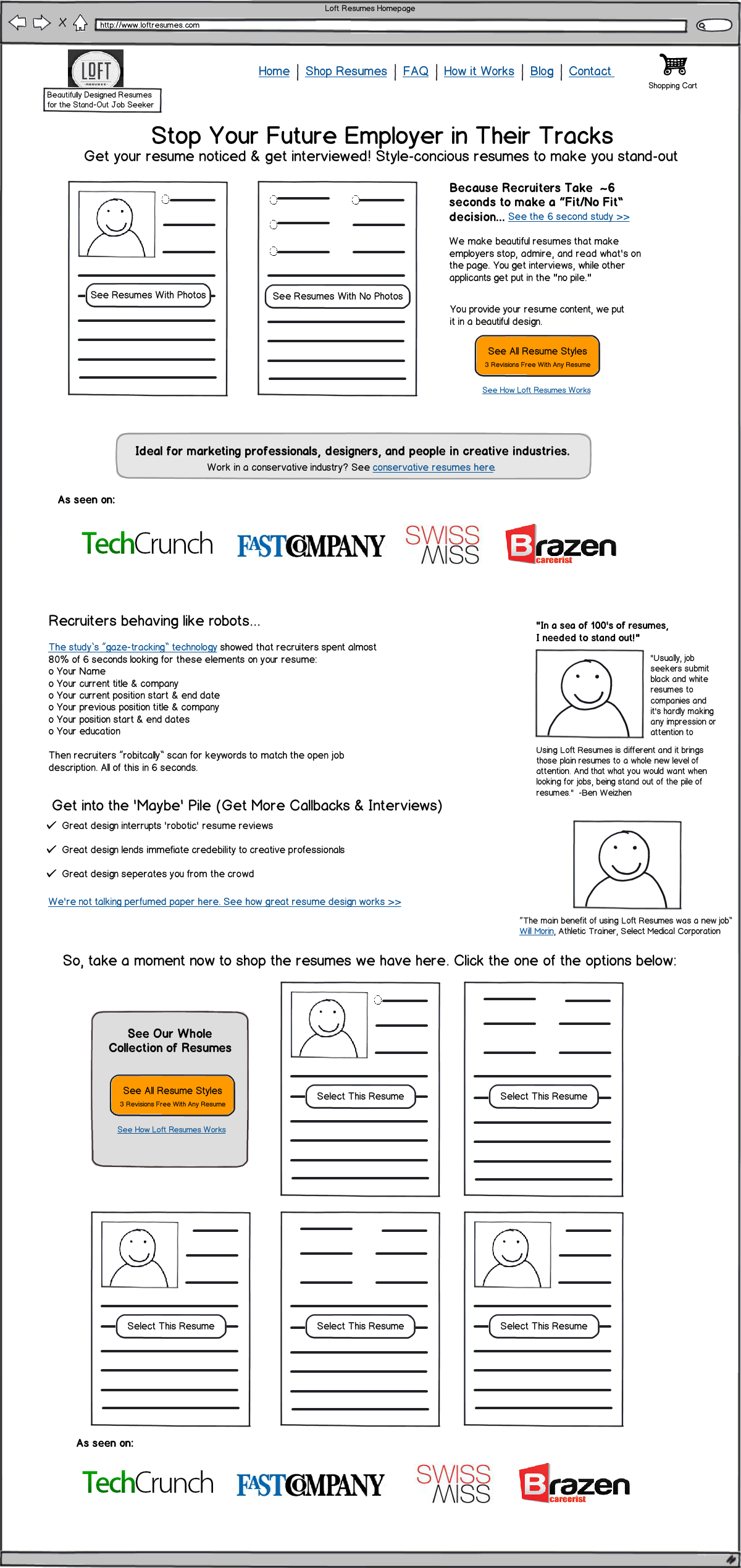
A first draft of the new sales message was drafted in Balsamiq. Take a look here:
This version of the new sales message was long enough so that NOBODY would read it. But I’d said everything I had to say. Now it was editing time – time to “trim the fat.”
I asked for advice from two awesome peeps (David Rawlings from Conversion Rate Experts & Joanna Weibe from CopyHackers), who were kind enough to take a look at what I’d written.
I incorporated their feedback in the next iteration of the page. I moved certain parts of the page into light boxes. Now the wireframe was ready for design, development, and testing.
Final Version of the New Sales Message:
Here’s the final version of the wireframe:
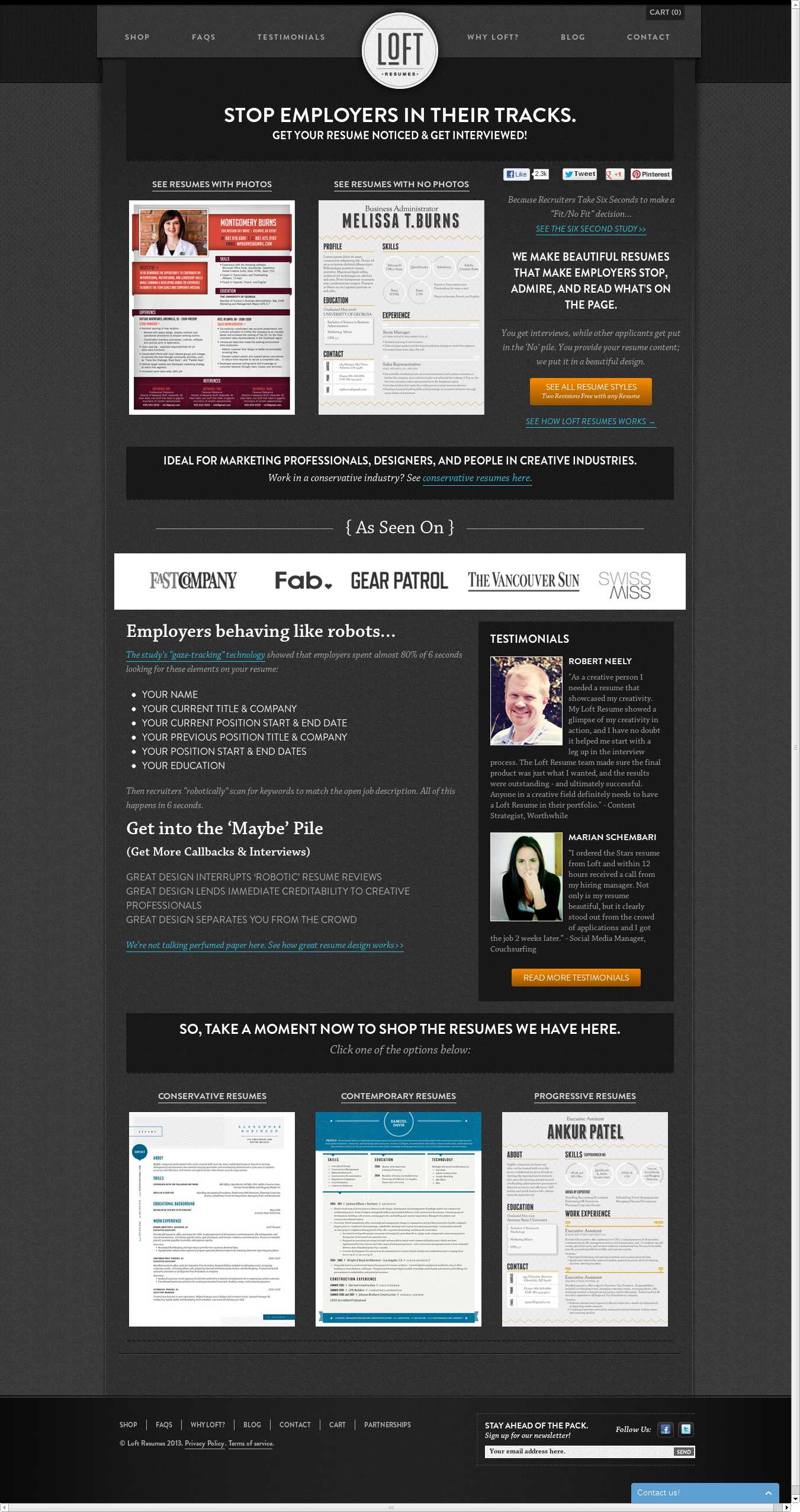
Next the wireframe was developed into a .PSD design, and then a webpage. Here’s control version of the page, and the final version of the webpage that went into testing:
Here is the control:
Here is the treatment for the homepage:
What Was The Result?
We’ll get to that in just a second. First, you should know there’s much more to interpreting a test result than what Visual Website Optimizer tells you…
How to Approach Testing to Prevent “Lying” Data…
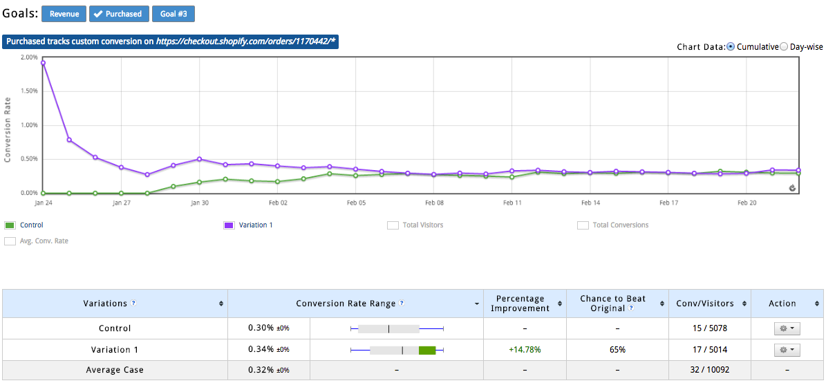
We wanted to prevent making decisions based on false results. So… The first thing we did was run an A/A test to establish a baseline conversion rate and make sure there wasn’t any funny business happening on the site (ensuring a clean testing environment).
As you can see, the exact same page performed 14.78% better than itself, but this is due to the algorithm used by VWO. Eventually the two lines matched up to be pretty much exactly the same. So, we ended the A/A test, and declared the testing environment clean.
Results – Putting (Their) Money Where My Mouth Is:
I tested the new page treatment against the control.
We let the test run for long enough to reach statistical validity before ending it.
What were the results?
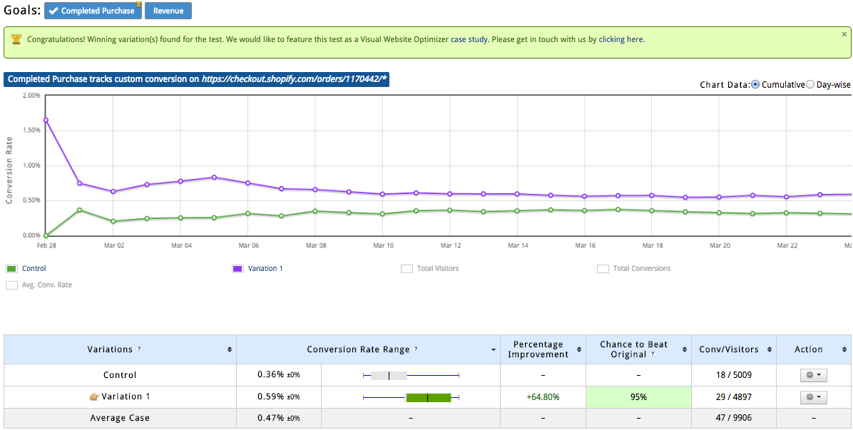
Here’s a screenshot for completed purchases out of VWO:
Sweet! We’re stoked that we got 64.8% more people buying from us, right? Not so fast!
Getting to 95% confidence only means that we have a winner. In fact, by looking into how visual website optimizer does its calculations, we can only honestly say that we’re 80% sure, that 95% of the time, variation 1 will outperform the control. Tricky shiz, I know!
So the way I interpret this is that variation 1 is definitely a winner – but by how much? We don’t know.
Okay! Okay! Okay! I hear ya. You’re all like: How do we deal with the fact that…
Split Testing Tools Lie?
Neil Patel knows that you DO NOT see the full impact of a conversion rate increase in your revenue numbers. Most other businesses that split test know this too.
I’m not trying to help people make bad decisions, so here’s the best way I’ve found to evaluate the size of your conversion rate lift…
I like to provide 2 estimates of the conversion rate: The lift reported by VWO, and a “Conservative Lift” —- which means I base my calculations off of the bottom of the conversion rate range provided by VWO.
If that sounds confusing, let me explain. Your conversion rate is not constant. You don’t get 1 conversion for every 100 visitors every time. There’s randomness and variance to how many people come to your website vs. convert. So when VWO gives you a conversion rate range, it’s telling you that the lower threshold for your conversion rate is X and the higher threshold for your conversion rate is Y. VWO then averages the points within the range. The average is your conversion rate.
Got it? Cool… enough with technical nerd talk. Let’s talk analytics. (Okay, more nerd talk…)
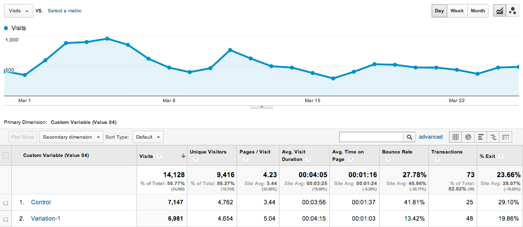
What was the impact of the test on the way people used the site?
Boom!
Upon analyzing the test in Google Analytics, we realized several interesting things about the treatment we tested. The short of it is:
– People looked at more pages of the site during their visit
– Bounce rate decreased, which means more people stayed on the site for more than 7 seconds
– Less people exited the site from the homepage.
How Did The Test Affect eCommerce Metrics?
Now let’s look at the impact of this test on ecommerce metrics. I’m segmenting here to see the difference between new and returning visitors for each variation tested…
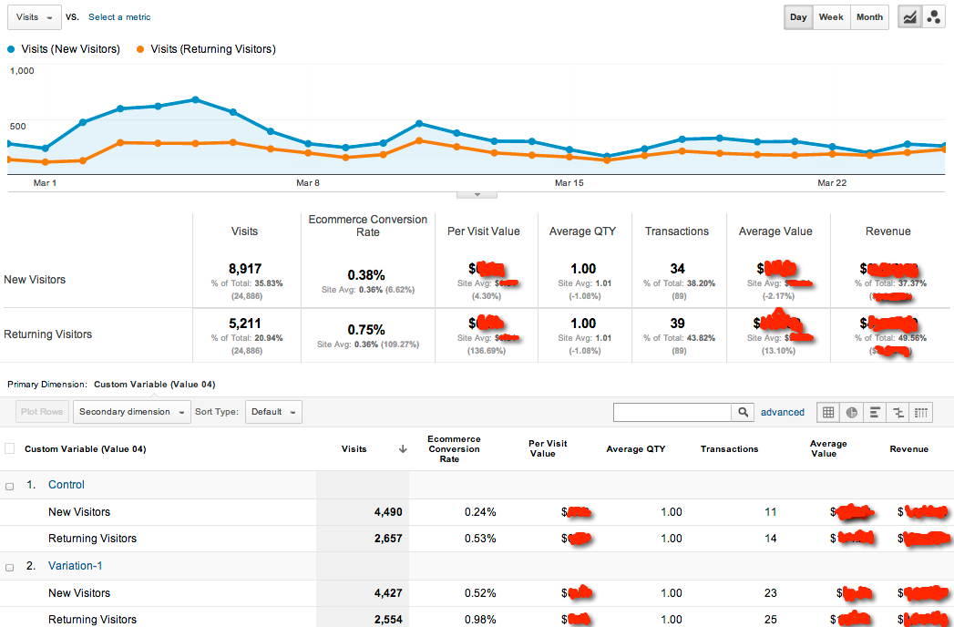
So again, after looking at the numbers, we got some cool findings:
Revenue per visit increased – particularly for returning visitors. This increase was big enough to justify starting a strategic remarketing campaign for Loft Resumes. According to Google Analytics (which is based on ‘visits’ and not ‘visitors’), ecommerce conversion rate nearly doubled for both new and returning visitors. Average order value actually decreased (mostly due to one really large order that happened to enter through the control). Nonetheless, the additional transactions from the treatment created more revenue for Loft Resumes.
So there you have it, how to write a new page treatment with a product market fit survey, and how to analyze the impact your test had.
Have you tried using surveys before? What kind? Do you use Google Analytics to measure the impact of your test? Tell me in the comments below.
