People don’t think thoroughly enough about how the people visiting your website will interact with it’s pages.
Sometimes, we can’t predict what people will do, because it’s a surprise to even them.
What you didn’t know is that there are area’s on your site that people are clicking, but not getting the outcome they expected.
Especially for affiliate websites, there are places on your site that people click expecting to be taken somewhere else, but lo and behold nothing happens when they click.
This can mean the difference between someone who bounces of your site, never to be seen again, and someone who engages further with your site, all the way to becoming a converted customer.
Big problem right? This is exactly what was going on with an affiliate site I was working on.
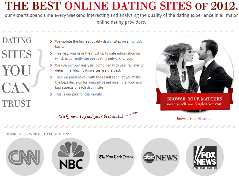
Here’s the site, take a look:
Since this was an affiliate site, we wanted to direct visitors to click on the button, which took the visitor to a dating website, via an affiliate link.
We’d recently redesigned the site, and felt calling out the button with red hand written text, and an arrow would bring sufficient attention to the main call to action on the page.
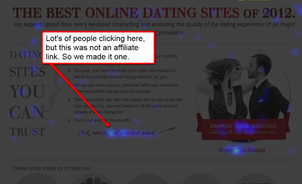
I installed Crazy Egg, and let it run for 500 clicks, which revealed an interesting insight.
People were clicking on the red hand written call out, expecting to be taken to the next step in the funnel.
Here’s a snapshot from Crazy Egg:
So, long story short, we adjusted the call out to contain the same affiliate link as the button, and we saw an increase on the click thru for our goal on this page.
Are you using software like Crazy Egg on your site? Do you know if you’re losing clicks and revenue, because of small design issues like this?
Tell me in the comments, and if you liked this blog post stick your email in that box below, and I’ll send you more stuff to help you convert your visitors into buyers.
That’s all for now. Talk soon.

